(Note: This is the second part of our feature on Psion computers. If you haven't already, we suggest reading the feature on the earlier 3a first to get more background on Psion and its design approach.)
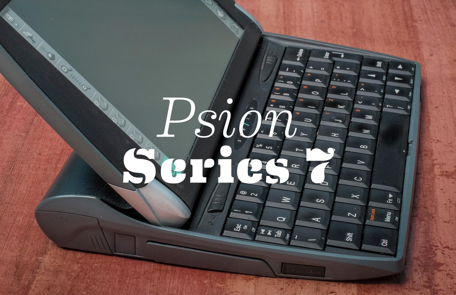
Before there were netbooks, there was the netBook - the Psion netBook to be precise. Aimed at enterprise users, the Netbook was launched in 1999 and proved popular enough for Psion to create an almost-identical consumer version, dubbed the Series 7. (Psion got into a trademark dispute with Intel, who had started to use "netbook" generically). Shown here is the 7 that I bought in 2000 and continued to use for two or three years.
Like Apple, Psion took a vertically integrated approach to hardware and software in its products, and for much the same reasons: it ensured much greater optimization of the very limited processor power, RAM, battery and display technologies of the time, and the freedom to really hone the quality of the user interface. In addition to Psion's internal engineering team, British design consultancy Therefore had a long partnership with Psion and did the industrial design and much of the mechanical design of the machines. Nick Healey led the UI design.
By today's standards the 7 is chunky and has a very low resolution screen (VGA and poor color depth). But its footprint was ideal for a small note-taking companion, especially on airplane flights or at a conference or lecture. It was truly instant-on/off, so you could keep it closed (i.e. non-distracting) until needed, pop it open for a few seconds to jot down notes in a meeting, and then close it again - much more like using a tablet today than a laptop. The 7 had a terrific keyboard - about 75% conventional width but with excellent travel and feel, and one learned to touch type on it quite easily.
Compared to a 13" Macbook Air
The Series 7 had a wedge shape long before the Air
Continuing Psion's tradition of innovative hinge mechanisms, the Series 7 had another hinge variation. This one was less complicated than the 3's, but it was very sturdy and held up well when poking at the touchscreen. The blue-ish-gray genuine leather cover did triple duty - it looked great and gained a patina over time, it felt great and grippy, and its natural flexibility covered what would otherwise be a large gap with the hinge.
A great feature of the design was that the hinge was inset from the rounded back edge. This made the 7 less tippy when touching the screen, and it was easy to cradle the 7 in one arm with your hand gripping around the back, while your other hand typed.
Compact Flash Card memory expansion
...and a PCMCIA modem - 56kbps!
Quick-access icons on the touchscreen
Stylus pops in and out from the side
Pen-length Stylus triangular in cross-section
On/Off slider switch (opening screen also turns on machine)
What gives it soul?
The Series 7 shared much of the ethos of its older, smaller sibling, the Series 3:
Striving within constraints: Psions had very little CPU and memory to work with, and yet they strove to act and feel like full-fledged computers. Designed before the concept of syncing with a desktop computer existed, they assumed they had to be stand-alone and self-sufficient, despite their obvious limitations. But the engineers and designers were so successful that you were never really conscious of the limitations at the time. They just worked.
Going beyond the expected: The PDA market was mostly populated with utilitarian looking machines with clunky interfaces that only geeks could love. Psion sought to make something better: easy and pleasant to use, with little surprises that added to the experience, such as the intricate hinges.
But the 7's shelf-life of relevance was shorter than the 3's. Despite its "netBook" origin, it was the net part of things that Psion never figured out, and regular laptops became more connected, smaller, and instant on (for Macs at least) faster than Psion could keep up. Even by year 2000 standards, a 56kbs modem card was getting pretty stale. These competitors weren't necessarily easier or more pleasant to use than the 7, but they were more connected in the ways that matter: office productivity, the web, wi-fi, Bluetooth.
It's often the case that a product category reaches its pinnacle just as it is superseded by another, and that was the case for Psion's Series 7.

