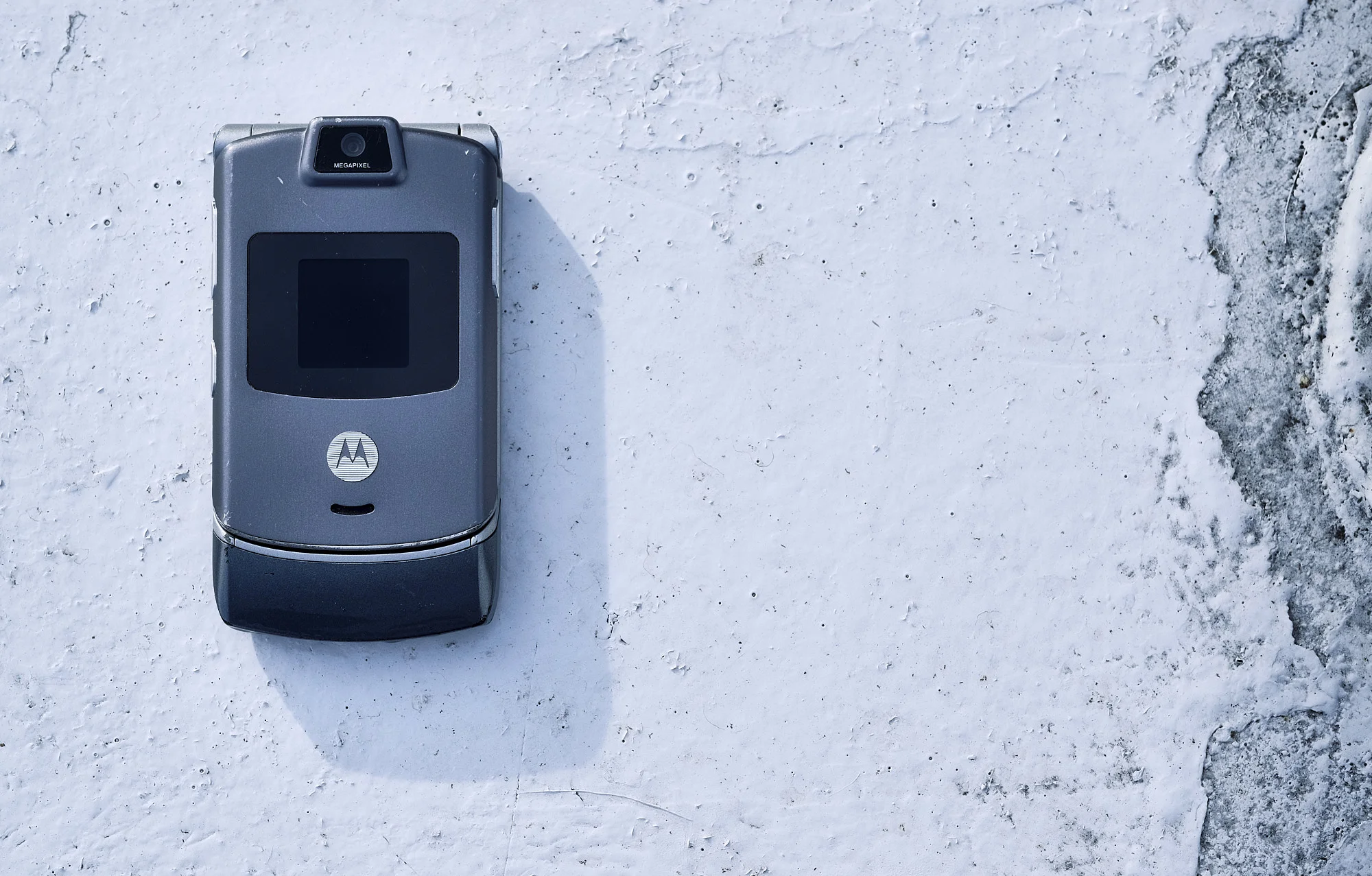
The RAZR V3 was introduced by Motorola in July 2003, and went on to becoming the world's best-selling cellphone for three years straight. Along the way it became an icon of industrial design, presaging and influencing our contemporary aesthetic of minimalist, angular forms, liberal use of metal finishes, and attention to tactile qualities.
But it was never intended to be such a popular product. The RAZR was developed as a "skunk works" type project outside the confines of Motorola's highly regimented product development process, which ran like a train with multiple stage gates that had to be passed, including targets for retail price (as low as possible), sales volumes (as high as possible), and endorsement of cellular carriers in different worldwide markets.
The RAZR had an astronomically high initial price - $500 - and was anticipated to sell no more than 800,000 units worldwide. (Supposedly the team actually thought they'd sell 300,000, but 800,000 was deemed a more palatable minimum.) On top of that, no carriers were interested in it.
All this was in a context of Motorola desperately looking to claw its way back to its earlier glory days as a pioneer and sales leader in cellphones. Nokia and the increasing strength of the Korean brands had eroded Motorola's position, while Motorola itself suffered from its ponderous development process and consensus-driven decision-making.
The team behind the RAZR was small and passionate, with air cover from corporate interference provided by Motorola's CMO, Geoffrey Frost, who sadly passed away in 2005. His vision was, "We didn’t try to predict the market for the product based on history, we bet that if it was good enough, it would make its own market." What started out as a high-priced halo product to bring luster back to the Motorola brand, went on to become a mainstream consumer product with broad appeal and massive sales.
(Click any image to enlarge)
Phone as Fashion
“At the time, all cellphones had started to turn into these handy, nondescript, amorphous things. So the idea of going out and doing this thing that was very, very different would cut against everything everyone else was doing with handsets at the time.”
The RAZR was the first phone to recognize that cellphones, which had been mainstream for several years at this point, were on the tipping point to becoming fashion accessories, not just utilitarian products. For many years, cellphones had focused on performance aspects like talk-time and number of entries in the phonebook (yes, that was a thing, back in the day of limited storage capacity), and the market still was geared toward functional, rational reasons for decision-making. The RAZR realized there was an opportunity to make a product that people would more emotionally bond with.
From a specs standpoint, the RAZR was middling even by the standards of the day. The camera was a measly 1 megapixel (640x480 pixels), there was hardly any memory, and the UI wasn't particularly intuitive.
Design & Engineering Innovations
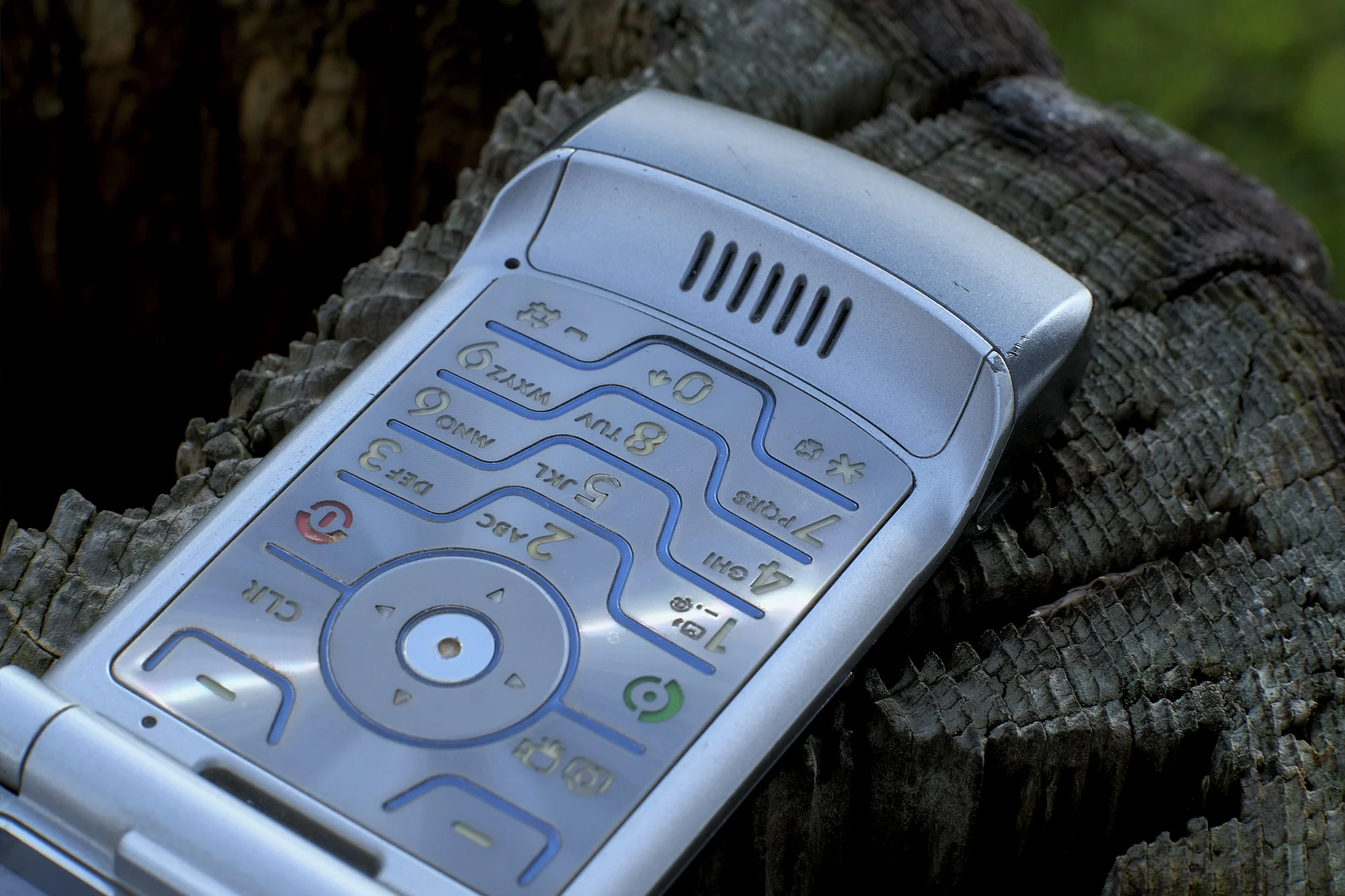
But these were conscious choices, because the main focus was on making the phone thin. This drove many of the design decisions. For example, instead of a usual keypad with rubber or plastic caps, the team employed an innovative backlit, laser-cut, nickel-plated copper alloy keypad that flexed when pushed. This has several benefits: it fit into the very slim case, the key tops were much larger than standard, and it had a visually distinct and compelling look. It's a great example of design solving several problems at once.
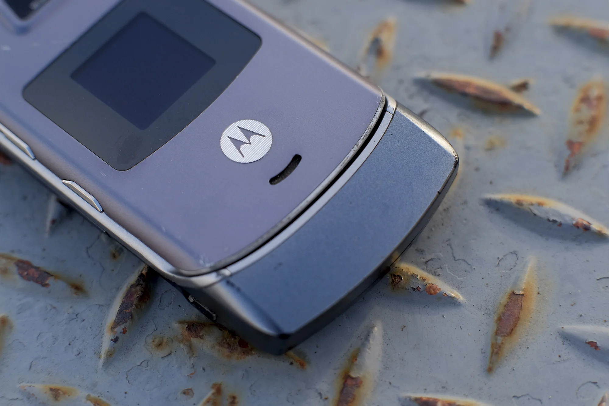
There's a small external color display, in addition to the main color display inside. The large chin at the bottom of the phone houses the antenna. (Since the phone is almost entirely metal, the antenna couldn't be placed at the top as usual, as the metal would block the signal.) This distinctive design element was borne out of engineering necessity.
In today's world of slab smartphones, we've forgotten the pleasure that comes from flipping open and closed a phone like the RAZR. It has a very satisfying and smooth action, and a crisp snick sound when snapping closed. The precision of the build quality, and the use of real metal throughout, are on par with products today. From a purely formal standpoint, if the RAZR were released today it would still be as cool as it was back then.
Motorola hammered on the cool-factor and its fashion status relentlessly, previewing it to fashion journalist at a Copenhagen art gallery, giving it away in goodie bags at The Oscars, making sure the right celebrities were seen using it, even doing a special edition with Dolce & Gabbana. And early on, the phone was in such limited supply, either because Motorola hadn't anticipated the volume or because they were cannily restricting supply purposefully, that it created pent up demand. Ultimately, Motorola essentially flooded the market, the price dropped like a stone, and the company rested on its laurels too long to really update the phone, let alone come up with The Next Big Thing. That was left to a first-time phone manufacturer, Apple.
A Boy's Phone for Girls
Something I've always liked about the RAZR was that it smashed stereotypes of what types of products appeal to women. The aggressively angular blade-like design was assumed by Motorola that it would be a masculine product. In fact, the RAZR's stablemate, the PEBL, was smooth and rounded and - crucially - much thicker, and it was intended to be the "girls" product. But it was a flop with all demographics. The RAZR's sleekness and styling made it appealing to everyone.
Simon Rockman, who was at Motorola at the time, recalls: "The scale of the hit of RAZR is hard to comprehend. Charles Dunstone of Carphone Warehouse ordered a quarter of a million in pink. We thought he was mad, this was a third of the global projected sales. He wanted this crazy volume of the "boys" phone to sell to girls in the UK. We gave him exclusivity on the pink colour. When he sold 3 million we bought the non-UK rights back."
Motorola ended up messaging about its thin-ness specifically to women, as seen in this TV ad. The company was also smart about developing a wide range of colors over the years (most famously several shades of pink), enhancing the phone's position as a fashion item, not just a utilitarian item. The design and messaging were right on point. The optimistic 800,000 units the team thought they needed to get past Motorola brass proved to be far short of the mark: in various versions the RAZR went on to sell over 130 million units worldwide.
What gives it soul?
The RAZR was such a groundbreaking design. It looked like nothing that had come before, and that look came about from challenging assumptions about what was really important to a cellphone buyer. The team behind it had a clear focus for what they thought was important, based on a belief (without a lot of concrete evidence at that point) about where the market was going. They had the discipline to let other things go or be sub-par, something tremendously difficult to do in an environment like Motorola at the time, driven by historically-derived metrics. They were unwilling to compromise on the vision they wanted to deliver. And they were correct and successful beyond their wildest dreams.
This vision and discipline - one might even say razer-sharp focus - shines through in the product, and really connected with people around the world.


