Olivetti Valentine Typewriter
Date introduced: 1969 Design by: Ettore Sottsass, Perry King Words and pictures: Adam Richardson
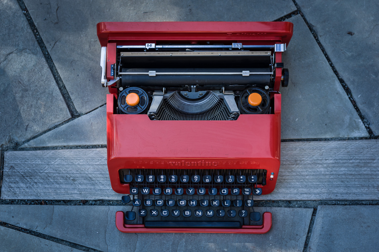
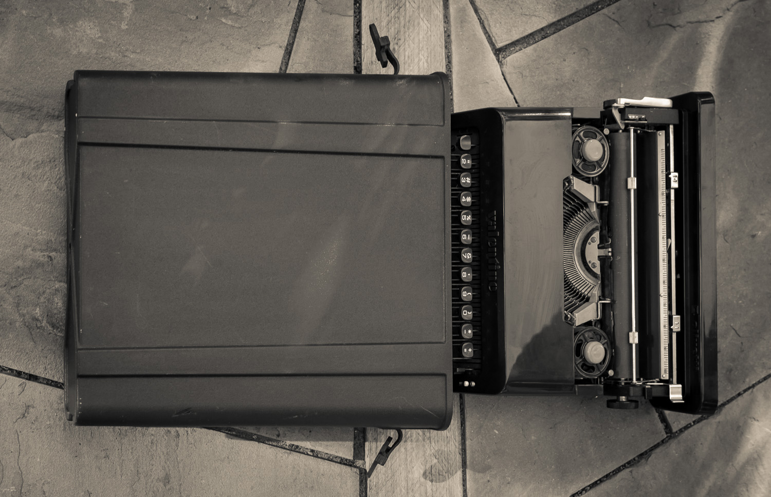
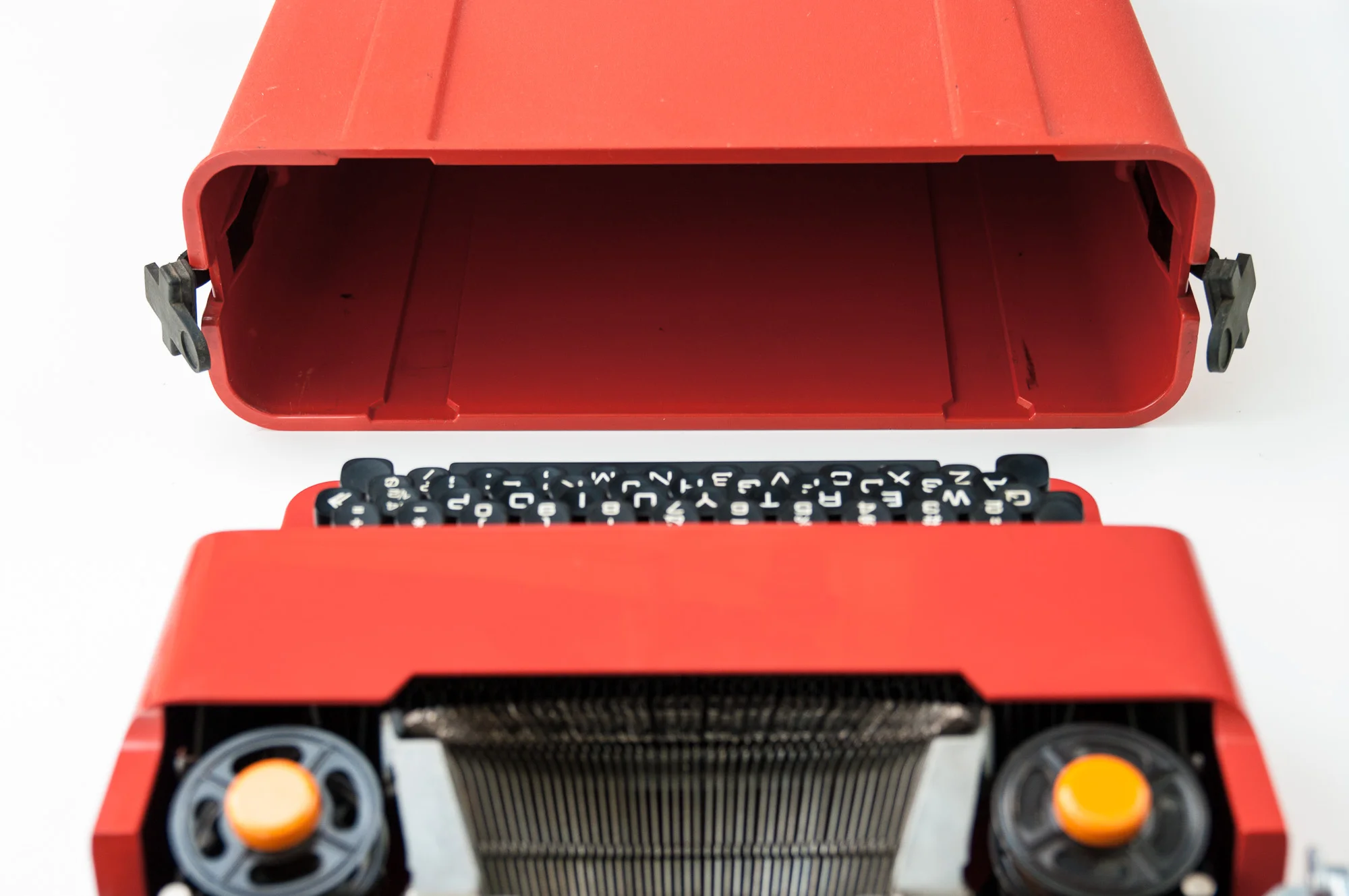
Designed by Italian Ettore Sottsass and Briton Perry King, and launched in 1969, this was probably the most famous of Olivetti's typewriters. Shown here in its signature bright red it, it was also produced in white, egg yellow, blue and pea green. It came with a slide-on case that ingeniously fastens to the back plate of the typewriter with rubber straps. Unfortunately, over time these would often dry out, crack, and break off. This example still has them intact, but given it's age, it's not a good idea to rely on them to carry it around!
The body is made largely of shiny ABS plastic, while the case has a heavy matte texture, and some key structural pieces, such as the ends of the platen, are of painted metal. The bright orange caps of the ribbon reels perk up the actual mechanism, something which in other typewriters is typically hidden from view.
Overall it's a very simple shape - an extruded rounded rectangle sliced at an angle where the keyboard is. The front bar appears to float in the air just below the front row of keys. As with any successful, simple, form, the proportions are perfectly managed, and there are successive layers of details and textures that add richness. It's a great example of a product that delivers a powerful first read (in this case mostly driven by the color) but then as you get closer and examine it from more angles and operate it, second and third reads of surface, proportion and details reveal themselves. As you pull the typewriter from its case, you are treated to one surprise of color and shape after another.
(Click any image to enlarge.)
The detailing throughout is functional and precise, yet with constant little surprises and flourishes.
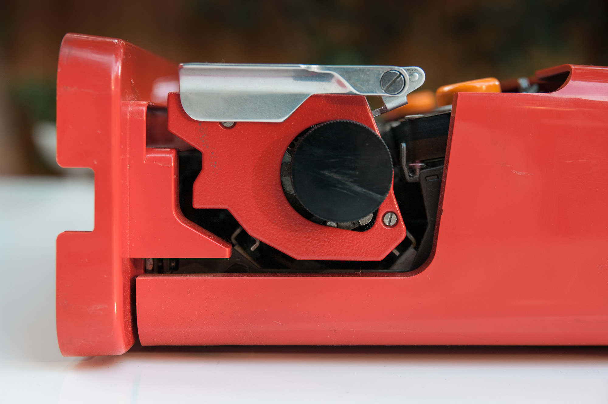
For example, the shape of the ends of the carriage is I'm sure largely driven by mechanical necessity, but it is a wonderfully dynamic profile with a complex interplay of negative space with the surrounding case. That didn't happen by accident - indeed, in our review of the book Ettore Sottsass, we include some collages that Sottsass did to study exactly these areas of a different typewriter.
The large fold-out handle on the back of the machine (what becomes the top when carrying it in its case) overtly invites picking up the Valentine and taking it along for a joy ride, much as the handle on the first Mac signified the same intent. The case itself was custom-designed to match the aesthetic, unlike most typewriter cases of the day, which were nondescript black or gray plastic, or perhaps semi-soft vinyl. This is another example of Sottsass' thinking about the whole user experience (as we would call it today).
Compared to the electric portables that would soon supersede it, the Valentine is fairly light, and being a purely mechanical typewriter it has the benefit of not needing to be tied to a wall outlet. Of course compared to today's computer laptops it is a hefty and large beast.
Design Impact
The Valentine was conceived as competitor to the inexpensive units coming on to the market from Japan. Sottsass had some interesting ideas about how to simplify and lower the cost of the machine, such as not having lower case letters (EVERYTHING WOULD BE SHOUTING IN UPPER CASE!), removing the bell that went "ding" at the end of the line, and using an inexpensive plastic for the case. Olivetti rejected all these as too radical, and used the higher-quality ABS plastic for the case, which pushed the price up higher than Sottsass had wanted.
The Valentine was not a big sales success for Olivetti, despite its notoriety in design circles, and Sottsass ultimately became disillusioned with the process that resulted in the final product (1).
But in many ways it presaged the period in the 80's when stodgy, hard-to-use office computers would transition to the personal, portable computers and devices that we take for granted today. It was the consumerization of typewriting - an iconic consumer product meant to represent individual freedom of movement and expression, instead of being chained to a desk 9-5. In keeping with the spirit of the 60's and early 70's, this was a brightly colored poke in the eye to The Man, telling him to go stuff it because you're going to go enjoy a picnic and write your novel on the beach.
The Valentine is featured in the Cooper Hewitt, Smithsonian Design Museum, and a piece about it quotes Sottsass on his goal for the typewirter:
“For use in any place except in an office, so as not to remind anyone of the monotonous working hours, but rather to keep amateur poets company on quiet Sundays in the country or to provide a highly colored object on a table in a studio apartment. An anti-machine machine, built around the commonest mass-produced mechanism, the works inside any typewriter, it may also seem to be an unpretentious toy.”
From the collection of: Adam Richardson


