Psion Series 3a Handheld Computer
Date introduced: 1993 Design by: Therefore Words and pictures: Adam Richardson
Introduction to Psion
Before the iPhone, before Microsoft bought Nokia, before Nokia had the Symbian OS for its smartphones, before the Palm Pilot and Apple Newton...there was Psion. Psion was a UK company founded by David Potter in 1980, and was years ahead of others in terms of making computing personal and portable (Psion is pronounced "sigh-on", and stood for Potter Scientific Instruments, with an "on" at the end to give it a technical sound). Yet it never achieved the breakout success of Palm, and ultimately its hardware and software teams were split and eventually acquired. The software team formed the kernel of Symbian, which became the ill-fated OS for Nokia smartphones. But don't let that bias you - the Psion OS and UI were in many ways more advanced and easier to use than anything else at the time.
Like Apple, Psion took a vertically integrated approach to hardware and software in its products, and for much the same reasons: it ensured much greater optimization of the very limited processor power, RAM, battery and display technologies of the time, and the freedom to really hone the quality of the user interface. In addition to Psion's internal engineering team, British design consultancy Therefore had a long partnership with Psion and did the industrial design and much of the mechanical design of the machines. Nick Healey led the UI design.
This is a two-part feature, starting with the earlier of two machines, the 3a. We look at its big brother, the Series 7, in part 2.
Psion 3a
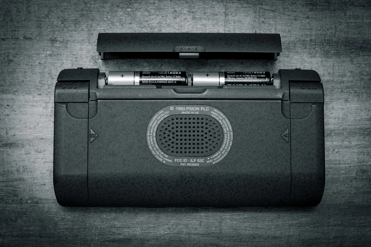
This was my personal PDA from about 1995 until 2000 when it was replaced with the Series 7. To this day, it remains one of the best pieces of consumer electronics I've ever owned. It was incredibly reliable - it never crashed or had to be rebooted once in those 5+ years of daily use - and the two alkaline AA's would last almost month.The chiclet keyboard was serviceable (certainly better than touch keyboards on smartphones), and the OS was very well optimized for the keyboard, with lots of thoughtful quick navigation touches that made working with it very streamlined.
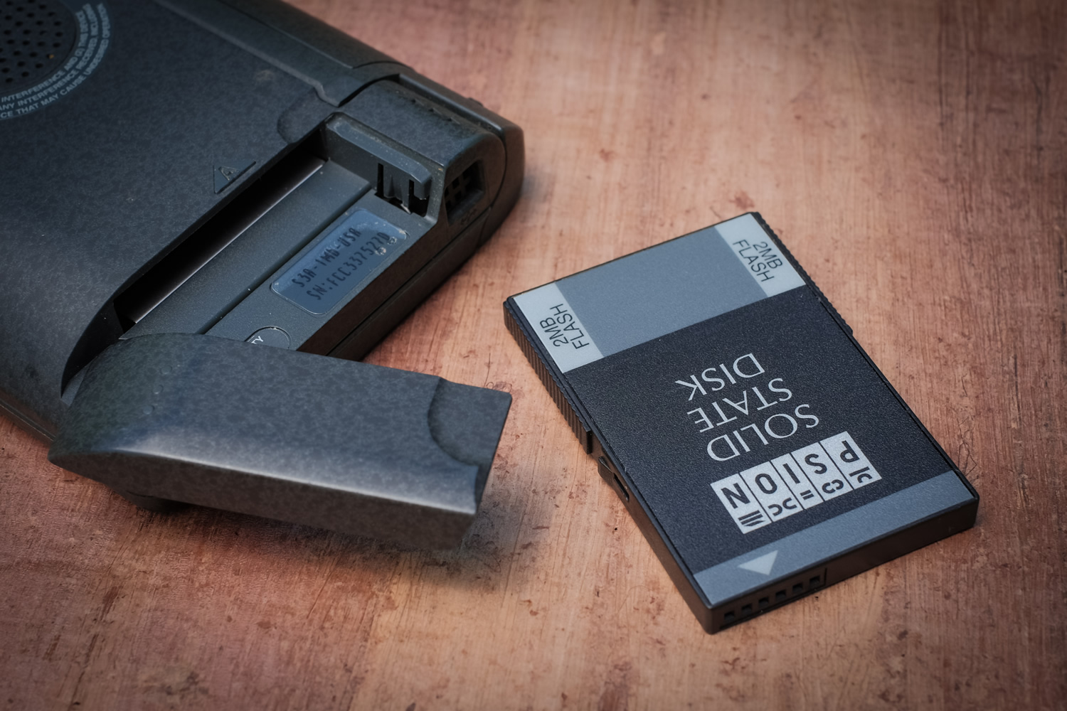
Before there were SD cards or even Compact Flash cards, Psion created a proprietary removable solid-stage card, and up to two could be inserted inside the winged doors on the back. Shown here is one with a whopping 2 megabytes! That tripled the built-in 1MB. That sounds like nothing, but consider that the file sizes were absolutely miniscule - just a few kilobytes or even less.
The 3a was the first time place I came across hydrographic printing, where plastic parts are dipped in a liquid that has an extremely thin printed film floating on it. As the part is immersed the film wraps around and adheres to the part (the process is also known as immersion printing). Psion used it to give the plastic case a subtle mottled finish that has both visual depth as well as soft-touch finish for better grip (also aided by the shallow ribs on the top housing).
Doing clever things with the hinge became a signature element of Psions starting with the Series 3. Psion's engineers and design consultancy Therefore seemed to delight in conjuring up a novel hinge design that not only made the clamshell work but also did something else useful - like prop the keyboard up at a slight angle to facilitate better typing. Looked at both from the outside as well as what happens internally with the "button bar" below the screen it is an impressive feat of miniaturized engineering, especially when you consider that the hinge/foot was almost entirely filled with AA batteries!
Unfortunately, these hinges were also fragile and would break over time or the ribbon cable running to the screen would die. In the sample shown here there is a crack on the left side of the button bar, and the bar itself does not collapse quite symmetrically, so care must be taken both opening and closing. Some intrepid users have fixed theirs, but it's not a repair for the faint of heart.
Therefore's Martin Riddiford was responsible for all of Psion's innovative hinges. David Tupman, formerly of Psion who went on to become VP of iPod and iPhone engineering at Apple, said “Martin’s a genius at making these crazy mechanisms work. So Martin’s job was to figure out the mechanism — and our job was to figure out how to fit everything in."
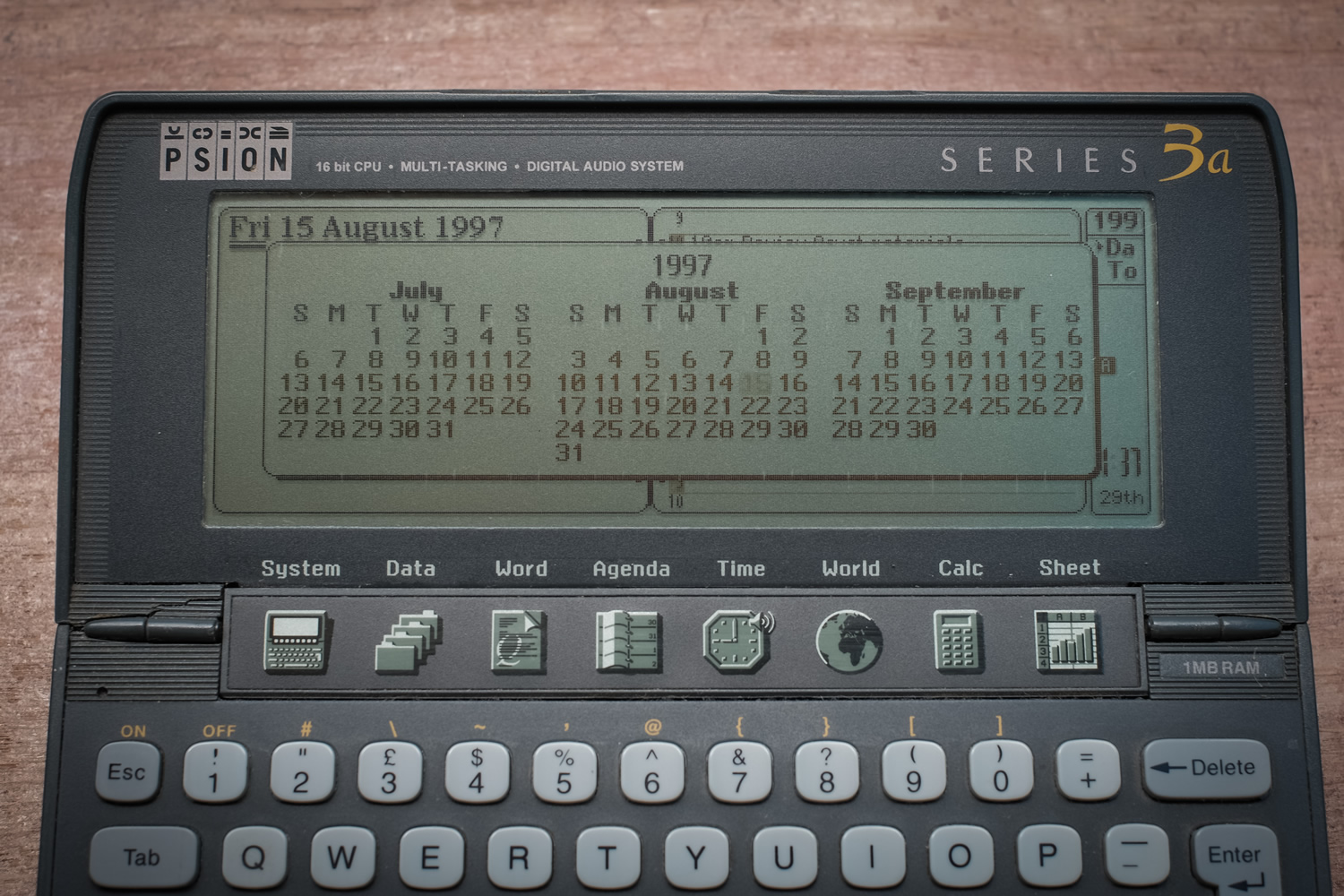
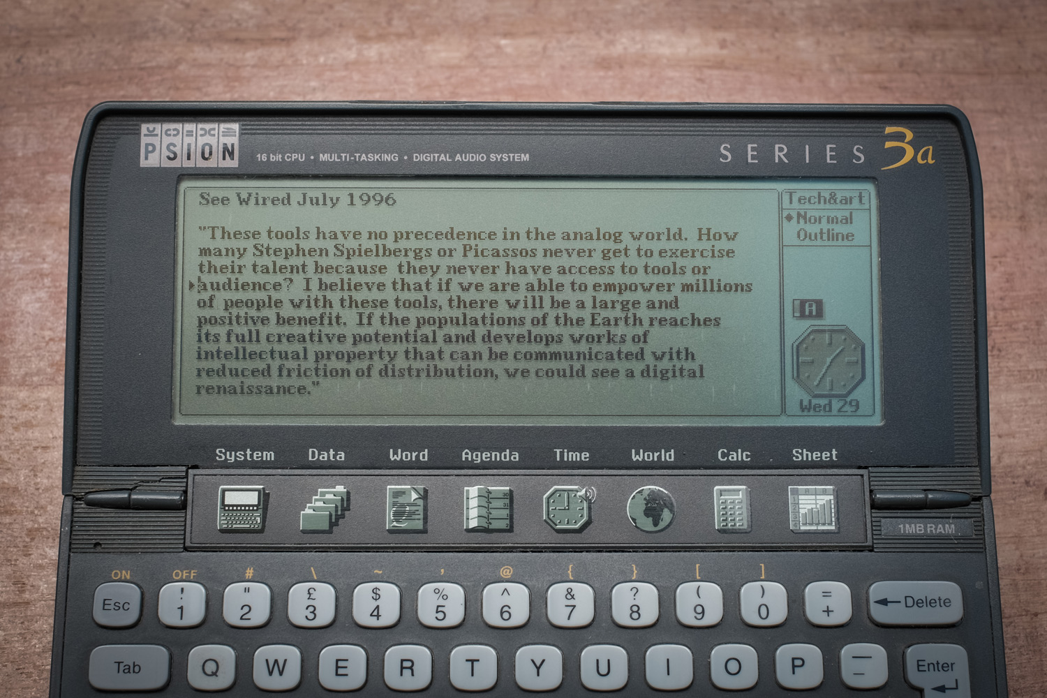
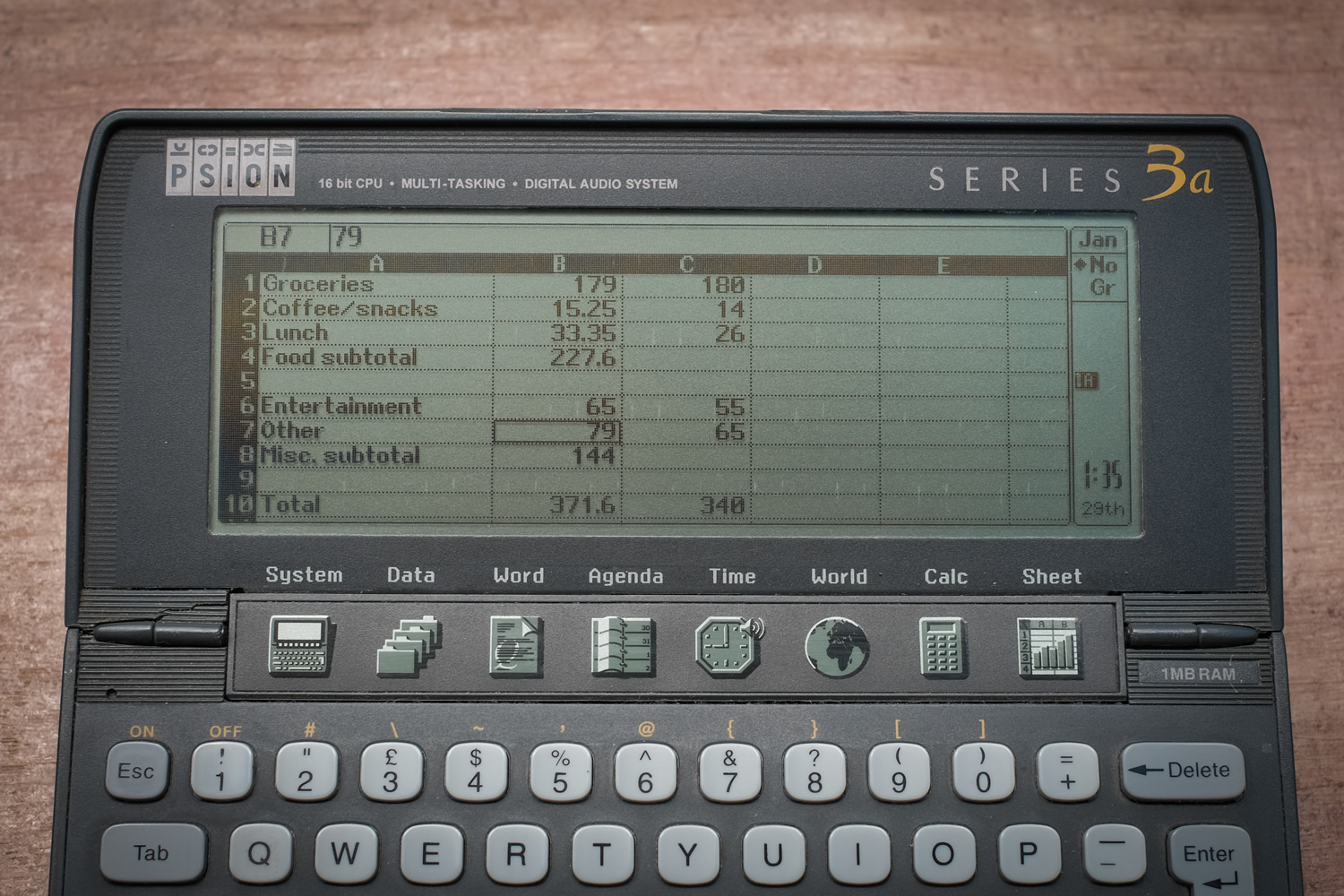
The button bar below the screen contained icons for the main built-in apps, giving one-click access to them (bringing up whichever file was last open). The modest little 3a had a full multi-tasking, object-oriented OS, so it was surprisingly quick at moving between apps, and you never had to worry about really shutting down an app. Even with only 3MB, I never ran out of room (of course, there was no such thing as mp3's or digital video back then...).
The UI had many thoughtful touches. For example, repeated taps of the Tab key in the Agenda app would bring up 1, 3 and 12 month selectors, making it easy to jump to dates. Repeat tapping of the space bar would toggle you between today's date and whatever other date you'd skipped to or done an entry on (a very handy feature I wish other calendars had). The word processor and spreadsheet were quite robust, similar to Google docs capabilities now (minus color and sharing of course).
The 3a's screen resolution was 480x160 and the CPU ran at less than 8 MHz.
What gives it soul?
For me there are a couple of things that really come through consistently in Psion's products and designs:
Striving within constraints: Psions had very little CPU and memory to work with, and yet they strove to act and feel like full-fledged computers. Designed before the concept of syncing with a desktop computer existed, they assumed they had to be stand-alone and self-sufficient, despite their obvious limitations. But the engineers and designers were so successful that you were never really conscious of the limitations at the time. They just worked.
Going beyond the expected: The PDA market was mostly populated with utilitarian looking machines with clunky interfaces that only geeks could love. Psion sought to make something better: easy and pleasant to use, with little surprises that added to the experience, such as the intricate hinges.
You can hear these qualities in how Psion founder David Potter talks about the company's approach to design:
“Perhaps it had to do with the culture I engendered in the company, which was perhaps a sort of Calvinistic culture. We have a set of values — one was the passion in the products for the market; we had to put our energy, skill and commitment into making really great products. The other was frugality — frugality in terms of how we engineered things. We did so with quality but not over-engineering, while cost was very important to our markets; It’s a fine balance. Integrity was another of those core values. Integrity in engineering terms and in other ways. I think these were good values, and these are durable ones. The core of the company really came from being contrarian — from not following the market wisdom. To be successful you need to be a bit contrarian.”
Ultimately, Psions were a line of the personal computing evolutionary tree that was a dead end. The standalone handheld was superseded by the handhelds as part of a connected ecosystem: first Palm, then smartphones and tablets. Psions were also very task and individual work focused, and it's not clear to me that they wouldn't have suffered the same fate as BlackBerry of not being able to make the leap to a real consumer lifestyle device. Nevertheless, from a user experience standpoint, their philosophy was very modern, and that came through very clearly in the end products.

